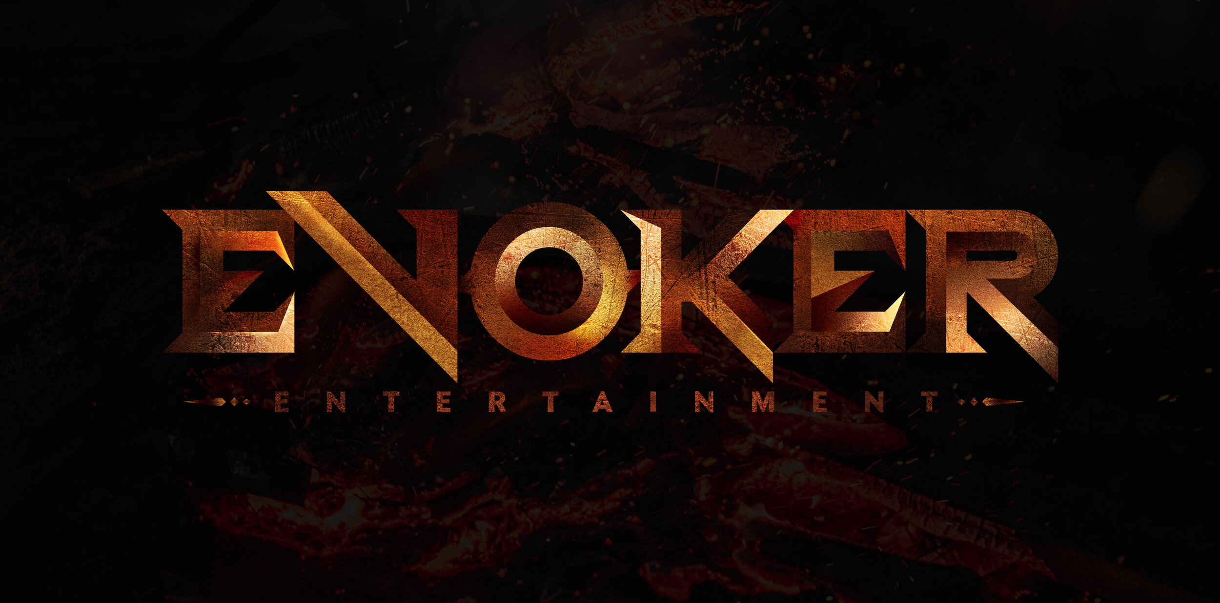
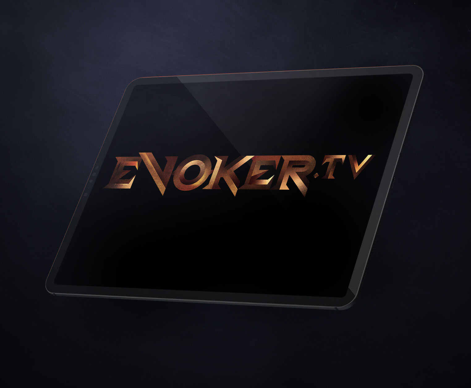
FORGE
This concept was inspired by the Bronze Age.
The advancements in metallurgy, such as the ability to smelt iron ore and forge weapons to slay demons and dragons is primal in its nature.
I wanted the type logo to come across raw and strong. Sharp bevelled edges resemble the broad swords in the fantasy genre.

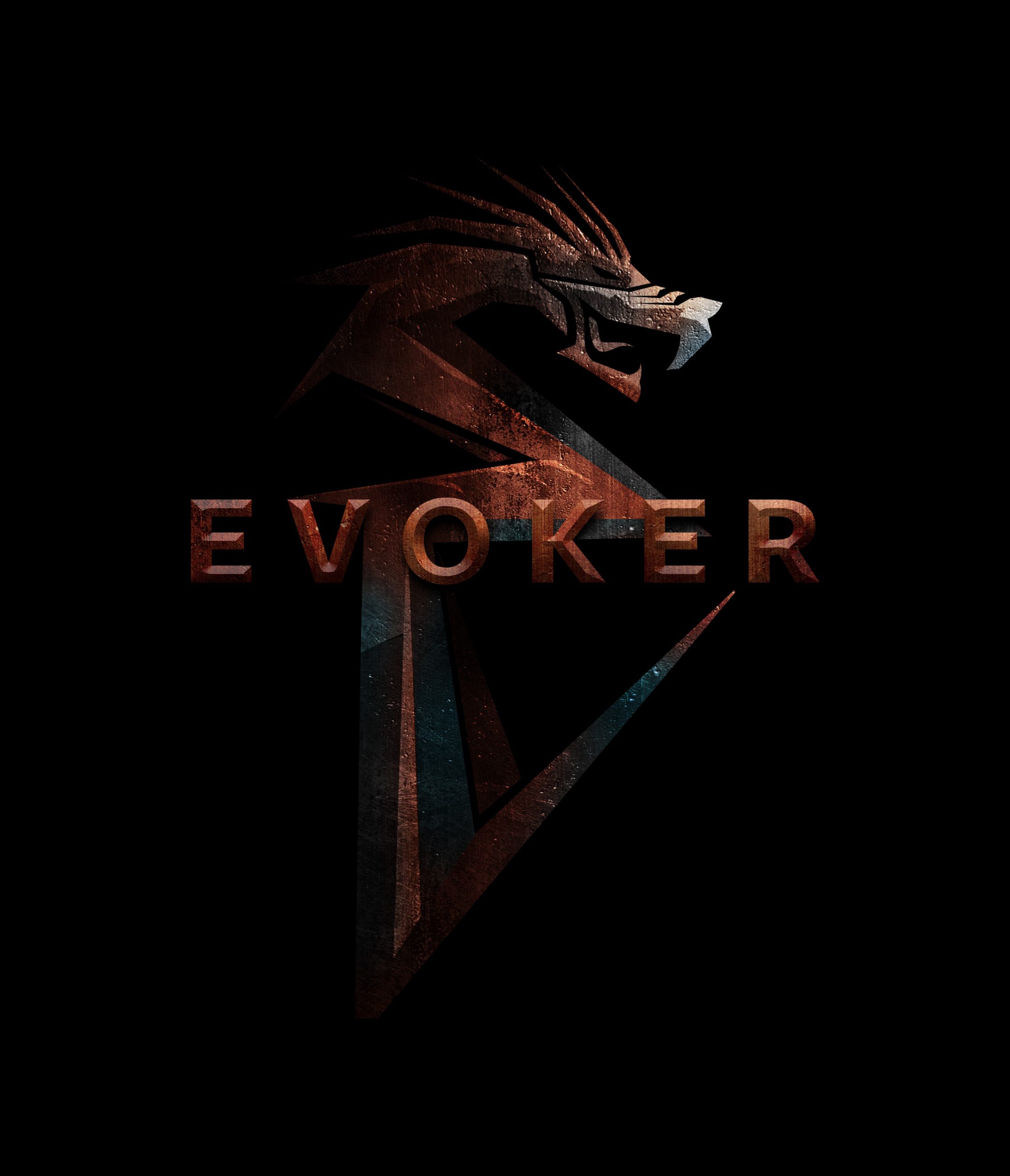
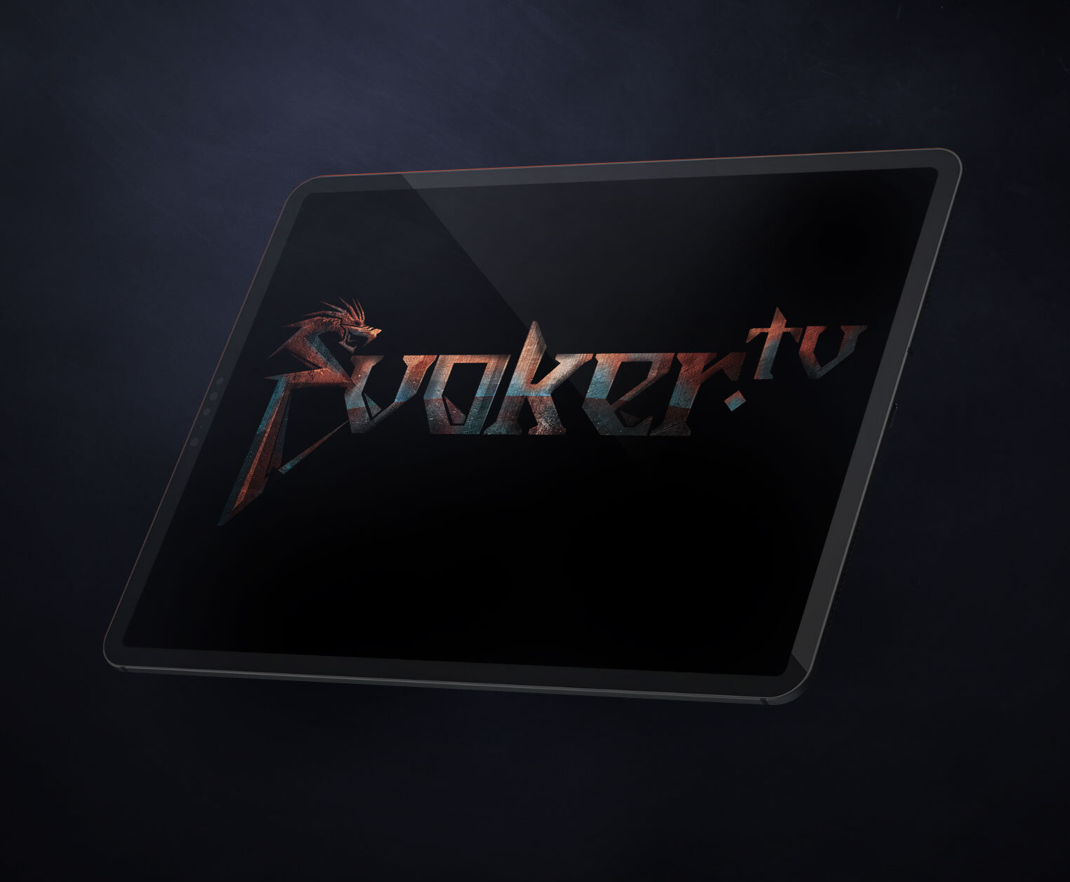
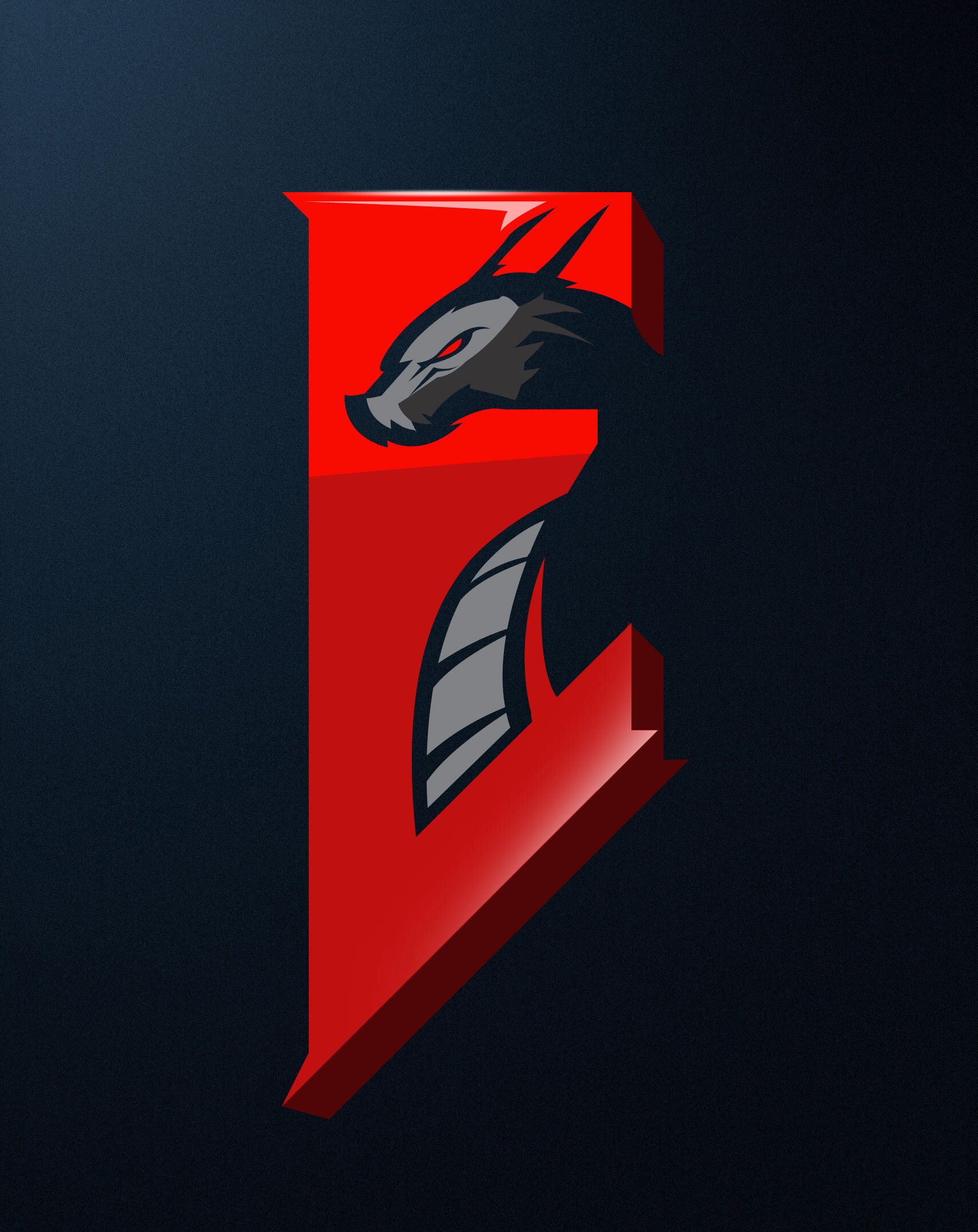
DRAGON
After much research around the genre, there is no doubt the dragon is on top of the food chain.
Rather than to shy away from using this mythical creature as a feature in the Evoker logo, we just need to know how to apply it tastefully.
The concept below is mature and the dragon forms an unmistakable and unique E for Evoker.

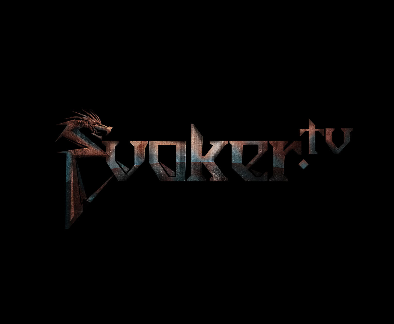
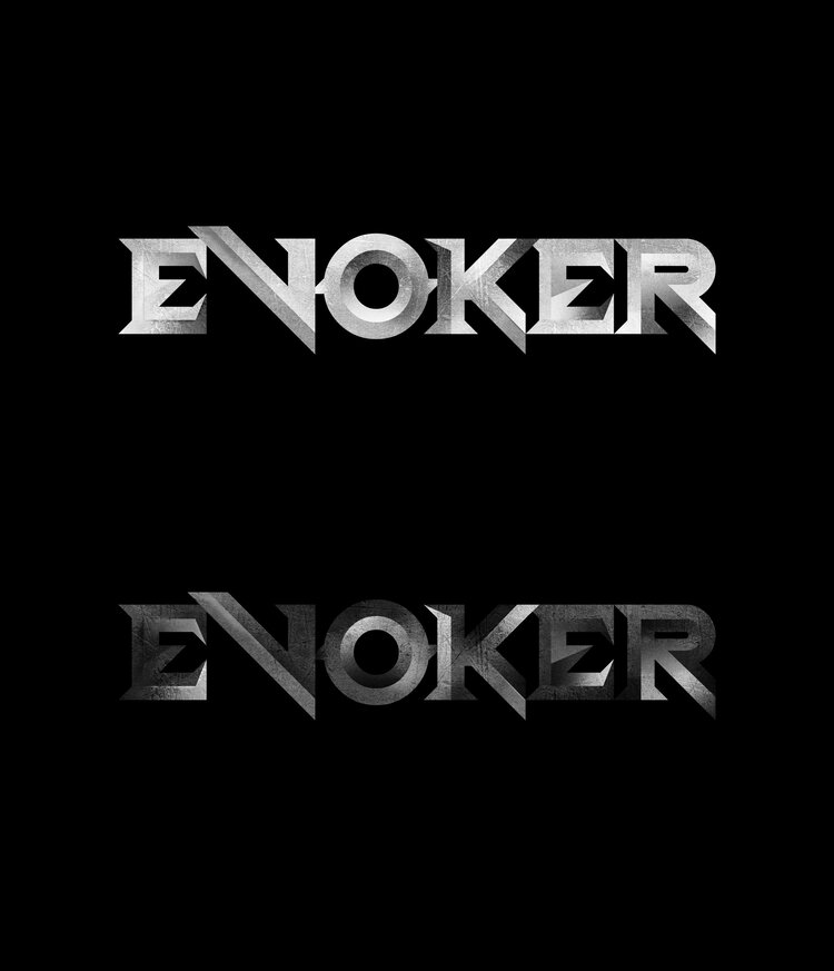
BLADE
Inspired by medieval Nordic culture, we have a type logo that’s bold and elegant.
Carefully composed, this logo drew crafting techniques from ‘Strange Things’ Using long straight lines and subtle curves –
there is a hidden sword in the logo’s negative space. Can you spot it?


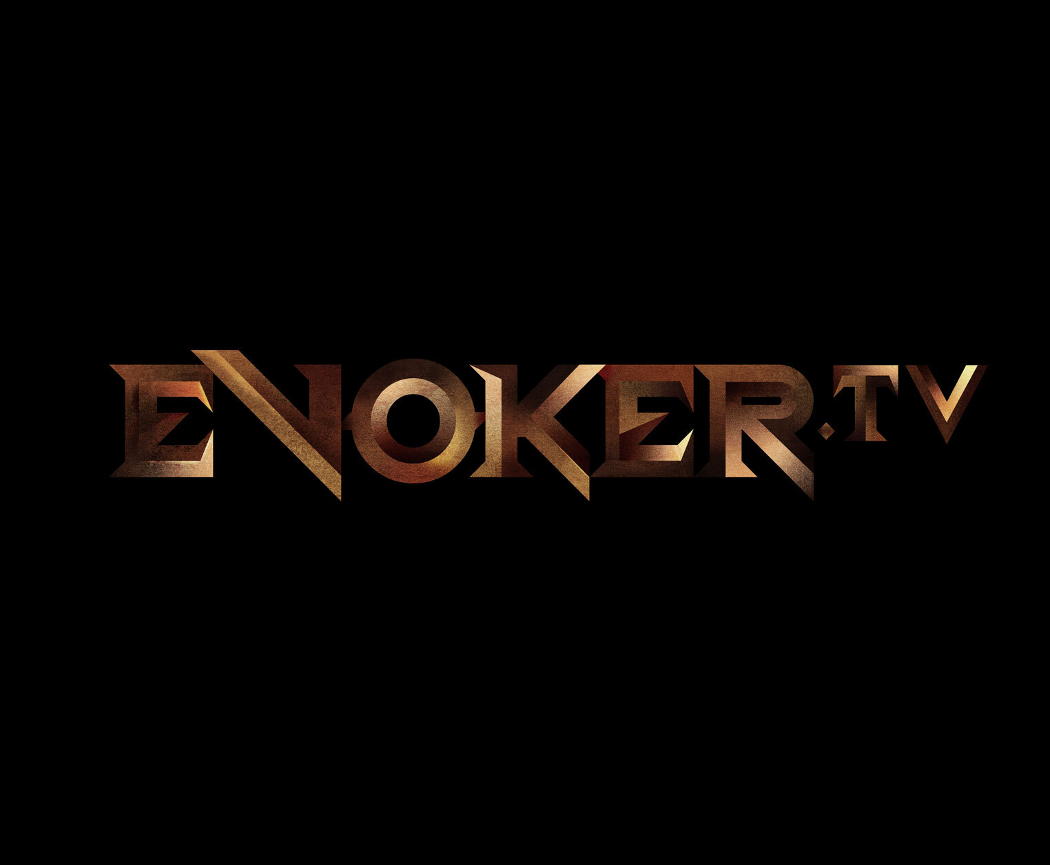
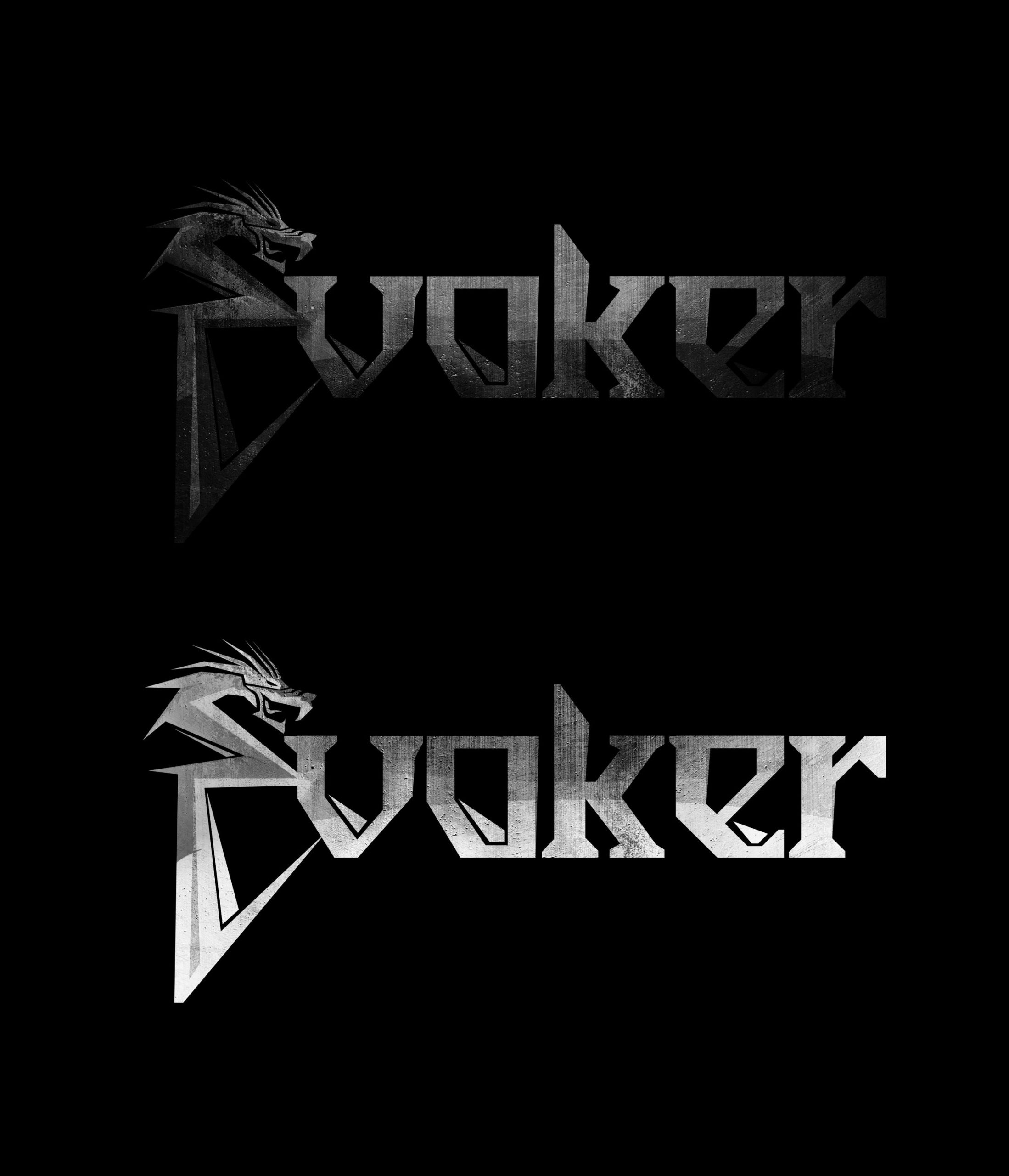
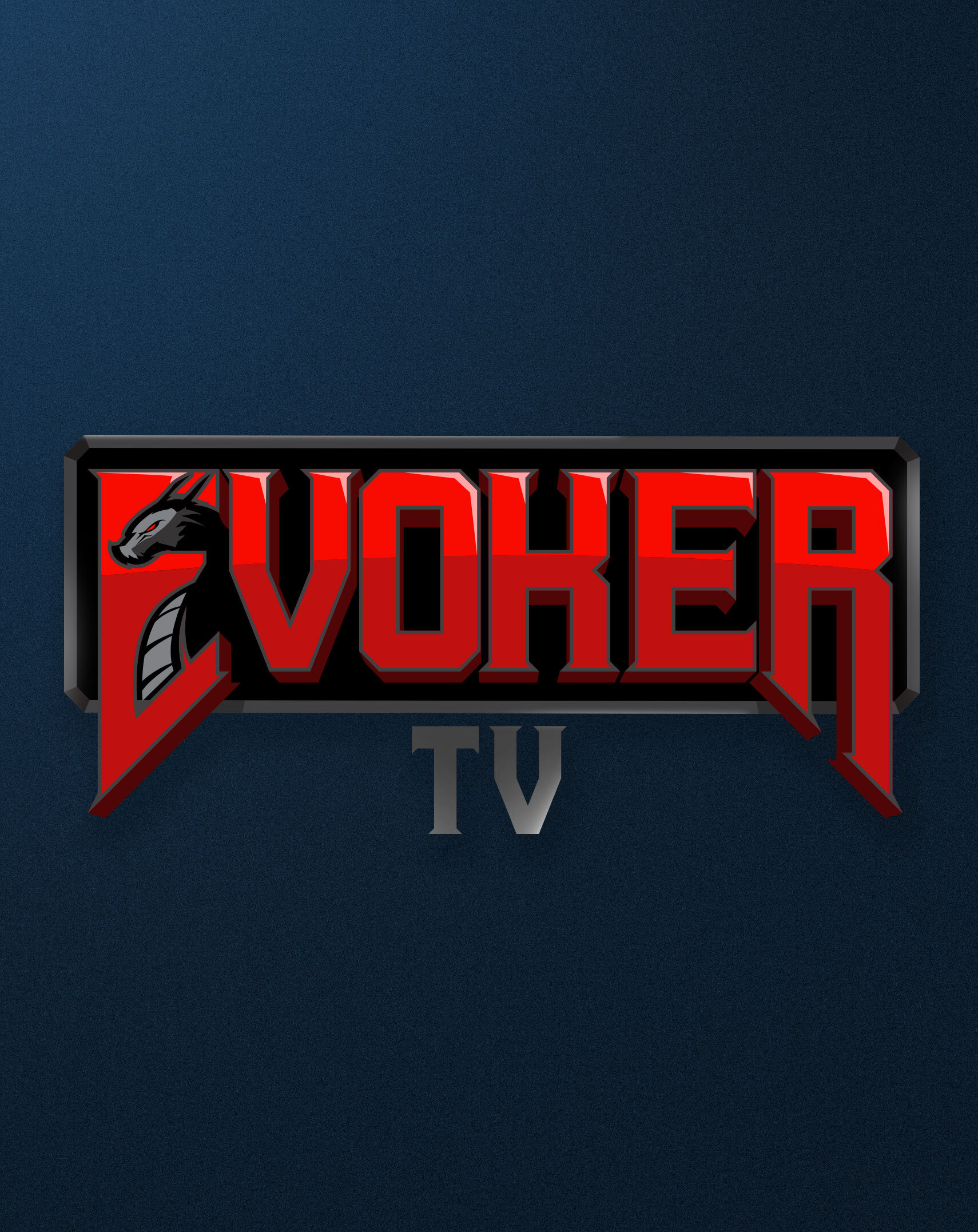
WYVERN
Sticking with the dragon motif, the logo mark below is a more approachable version. By removing elements such as grunge textures, scratches and patina – we arrive on a bolder, brighter style. Utilizing the negative space within the ‘E’, I’ve managed to carve out a dragon. It is best to keep the pictorial element with the Alphabet E so that the lettermark retains its brand identity. The concept below strikes a fine balance of maturity without having to dip its toe in the ‘bubble gum’ territory.
EYE
In this new concept, the mark is takes on a more approachable direction. Smooth curvatures and bold utilisation of colours and shapes form a dragon’s eye to replace the ‘O’. To further hone in on the dragon motif, a simple layer of scales is applied. This mark is refreshing and more universal.